I’ve learned the hard way that there’s a difference between organizing for form and for function.
With form, you’ve got your aesthetically-pleasing, color-coded systems and spaces. When I see these types of Home Edit-inspired set ups, I not only swoon, but I also feel instantly at ease and comforted.
With function, you’ve got your carefully-thought-through systems and spaces that are designed around improving efficiency and effectiveness. The whole point here is to save time and improve results.
It could be said that when organizing purely for form, it’s ego-based organization—meant to look good on the surface even if it doesn’t necessarily “work” on an execution front.
The good thing though? It is possible to have a functional system that also looks good. And I think systems and spaces that look good, feel good as long as they’re designed with function in mind too.
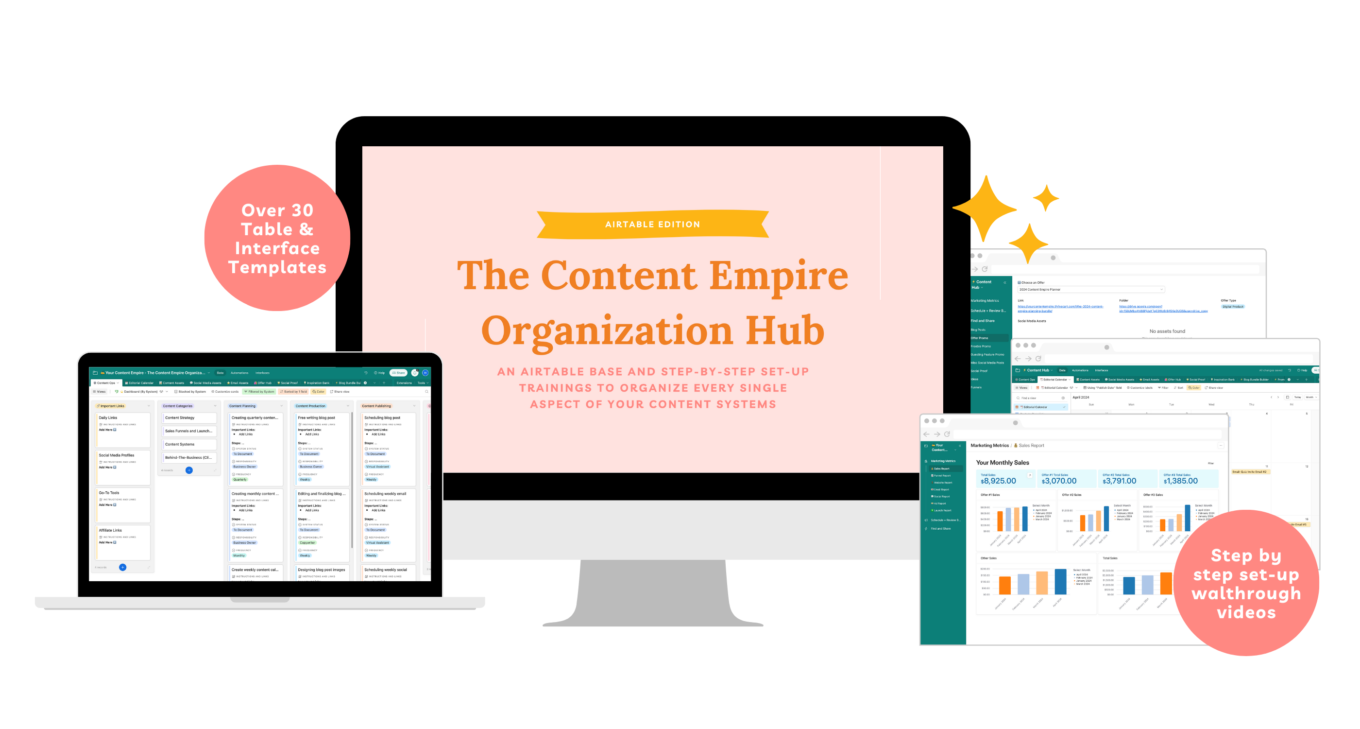
That’s the mission I had in mind when designing the Content Empire Organization Hub. I wanted something that you (and I) would be excited to set up but that was built for long-term use first and foremost.
Here’s how:
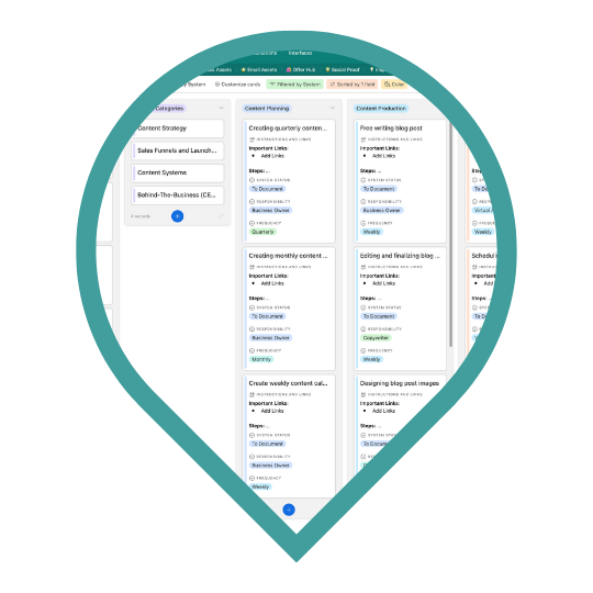
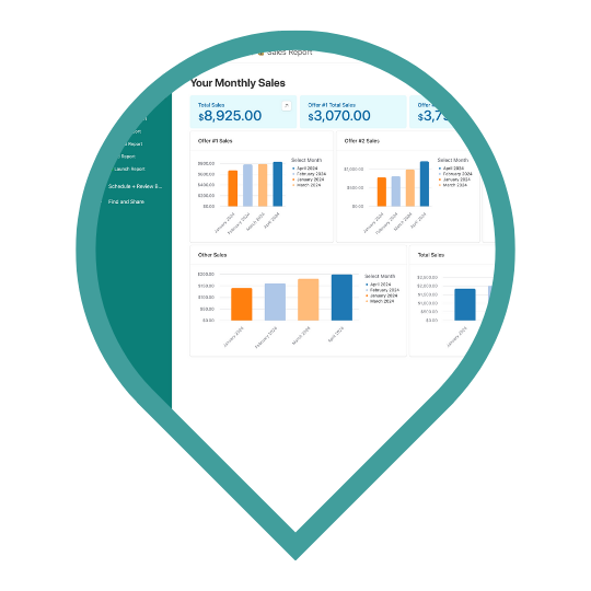
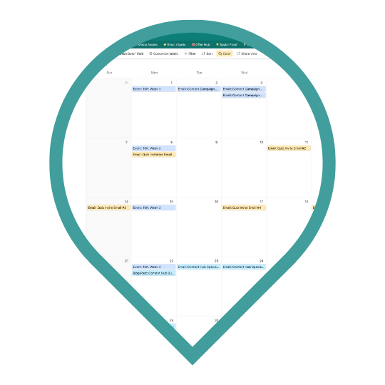
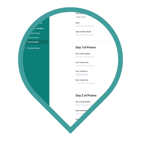
- It’s something that you’ll use every day and is set up to quickly add your info (whether that’s new content assets, monthly measurements, your content calendar, etc.) and get out right away
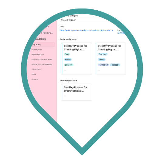
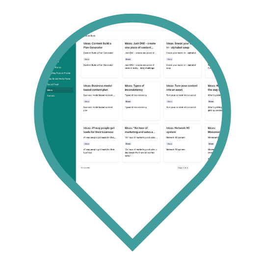
- It’s built with search-ability in mind between the interfaces and dashboards, you can filter and find what you’re looking for without having to dig through a ton of links and files
- It’s forward-looking and retrospective too to help you plan your content and promotions for the future and take stock of the content you already have.
- It’s set up for you—all you have to do is copy and paste in your own content and data and it’s ready to start using asap!
- It includes 14 set-up videos (all under 10 minutes) so you can set it up step by step along with me and learn to navigate Airtable confidentlytufy
Ready for your organizational head start?


