This post teaches you our signature funnel optimization process and gives you to 50+ ideas on ways to improve your sales funnel results.
Funnel results a little lacklustre? You may *think* you checked all the boxes during the funnel creation process, only to find out your funnel doesn’t convert. Or perhaps it’s not that your funnel isn’t working—it’s just not delivering to the level you hoped or expected it would.
So maybe you’re thinking somewhere along the way, you must have dropped the ball. Either that, or funnels are maybe just some hyped-up marketing trend that don’t actually work.
But before you throw in the towel on your funnel, know this: a sucky first funnel is all a part of the process. In fact, even pro-level sales funnels are rarely perfect in their first iteration.
Prefer to watch instead?
Funnel optimization isn’t some big red flag of failure—it’s actually a completely normal part of the process. Optimizing your funnel is a natural step all funnel creators should be taking, and that’s exactly what you’re going to learn in this blog post: The three steps to optimizing your funnel so you can increase your conversions, make a bigger impact and connect with more of the right people.
Embrace Your Inner Sales Funnel Optimization Detective
Whatever you do, don't throw out your funnel, no matter how bad you think it is right now. Your funnel isn’t broken! It just needs a little tweaking and investigating to reach its full potential (I go through the exact same process with my own funnels and client funnels in the agency too).
Keep in mind that the process you’re about to discover can be done again and again—rinse and repeat. As an agency, we run through the optimization process every quarter or so to improve funnels with our content on-demand clients. It’s best practice to periodically check the numbers, reflect on the data, and keep testing tweaks. Grab your beige trench coat and magnifying glass, and let’s get started.
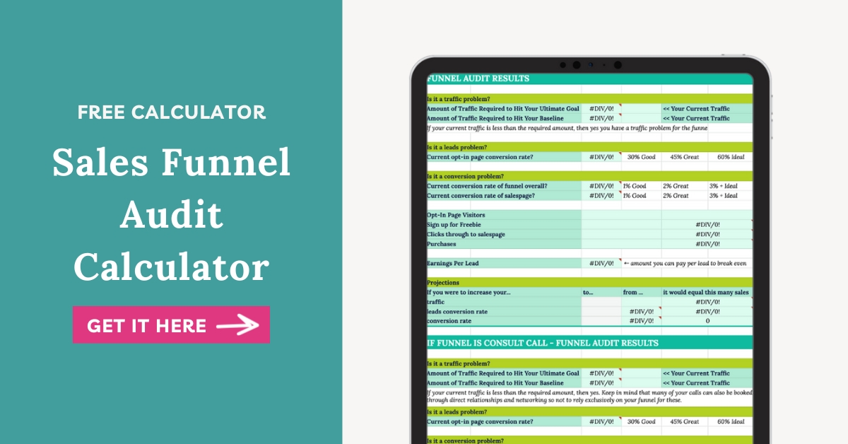
Step 1 – Download the Sales Funnel Audit Calculator
Before you can jump in and make optimal changes to your funnel, you have to identify where these changes need to be made. The Sales Funnel Audit Calculator will help you do just that. Is it a lead problem? Is it a conversion problem? Or is it a traffic problem? Although it can be a combo, usually one of these areas will jump out from the audit as the area that needs the most TLC.

The calculator is important because it saves you from wasting valuable time by allowing you to hone in your focus and attention where it’s needed. This means you can make impactful changes to your funnel right away and start seeing positive results sooner.
Step 1 action items:
- Download the Sales Funnel Audit Calculator to get started.
- Start your audit by gathering your basic funnel information. Your funnel name, timeframe for the audit, important links, and goals lay the foundation for your audit.
- Compile your numbers. Go through your funnel and gather the numbers for the timeframe of this audit as requested in the second tab of my free calculator.
- Check out your results. Review your results in the third tab and determine where you funnel could be performing better.
- Create your plan. Use this information to decide where you'll focus on first when fixing or optimizing your funnel (traffic, leads, conversions) and how.
Step 2 – Optimize Your Freebie System
Your freebie system is made up of all the pieces that go into and support the free gift that your people are exchanging their email address in order to access. This includes: the freebie itself, the opt-in page, the thank-you page, and the welcome email. Your freebie system also includes the messaging you use in the freebie and how well the freebie topic aligns with your audience.
The key to optimizing your freebie system is knowing your audience: Who are they? What kind of language do they use? What core problem do they need solved, and how will this freebie help them do just that? Your freebie invites them to solve a small problem and also opens the door for each individual to get to know you and, eventually, your paid offer(s).
Without an optimized freebie system, you may be missing out on crucial opportunities for funnel sign-ups. Here are some suggestions on ways to optimize various parts of your freebie system.
Freebie System Optimization Checks:
- Freebie Topic and Problem: Does the problem align with something that 90% of your audience is seeking help with? At the same time, how well does the topic of the freebie aligned with the offer(s) in your funnel?
- Freebie Name: Does the name of the freebie convey what it is and what it does clearly and concisely? Can you use a headline and tagline combo to make it clear and memorable?
- Freebie Content: Are there any missing pieces from the freebie that would increase the value and the chances that they’ll succeed in solving the problem? Or are there extra pieces that get in the way of the goal of the freebie? Is there a different format or delivery method for the freebie that would work better?
- Freebie Design: Does the freebie design align well with your brand? Is it appealing but also simple?
- Freebie Messaging: How well are you framing the problem through the copy? Are these words your audience would use to describe their problem and desired solution?
- Opt-In Page Headline(s): How well does the headline grab their attention? Is it clear? Is it accurate? Does it evoke emotion?
- Opt-In Page Copy: How well does the copy succinctly and clearly capture both the problem and the benefits of the solution (aka your freebie)? Have you written in bullet points to help scanners? Are your bullet points written as fascinators (so thats)?
- Opt-In Page Design: Do you have a mockup that makes the freebie feel more tangible? Is your text formatting in a way that’s easy to read? Does your page look good on mobile?
- Opt-In Page SEO and Sharing: Have you chosen a social sharing image that’s sized correctly when people share the page on social? Have to set the SEO title and description to include keywords?
- Opt-In Page Form: Does your form include extra fields (other than first name and email) that are unnecessary and decrease the conversion rate? Is the form formatted well? Look good on mobile?
- Thank-You Page Purpose: Is the purpose/goal of your thank you page strategic? What action do you want people to take on the thank you page and how well does the page perform that goal?
- Thank-You Page Headline(s): How well does the headline grab their attention? Is it clear? Is it accurate? Does it evoke emotion?
- Thank-You Page Copy: How well does the copy of the page capture the problem and benefits of taking or not taking the next step? Is the text clear, succinct and engaging?
- Thank-You Page Design: Is the page well designed and on brand? Is your text formatting in a way that’s easy to read? Does your page look good on mobile?
- Confirmation Email Subject: Does the subject line elicit opens (either through emotion, curiosity or personalization)?
- Confirmation Email Copy: Is the copy clear, succinct and engaging? Does it accomplish the goal (getting them to click the link and confirm their email address to get the freebie)?
- Confirmation Email Format: Is the text of the email formatting for online reading? Does the email look good on mobile devices? Are links bolded, underlined and in a contrasting colour? If you have a lot of visual elements in your email, have you checked if deliverability is impacted? (resource)
- Welcome Email Purpose: Have you clearly defined a goal for this email? How well does the email accomplish that goal? How could it accomplish it better?
- Welcome Email Subject: Does the subject line elicit opens (either through emotion, curiosity or personalization)?
- Welcome Email Copy: Is the copy clear, succinct and engaging?
- Welcome Email Format: Is the text of the email formatting for online reading? Does the email look good on mobile devices? Are links bolded, underlined and in a contrasting colour? If you have a lot of visual elements in your email, have you checked if deliverability is impacted? (resource)
- Welcome Email CTA: How clear is the call to action? Does the call to action stand out in the email at first glance? Could the CTA be re-written to increase click-throughs?
- Welcome Email PS: Optional – Do you have a PS that adds a touchpoint for the offer or gives an opportunity to jump to the sale or call right away? Or – if you have a tripwire on the thank you page, can you increase conversions by including a PS invite for the tripwire?
- Check-In Email Purpose: Have you clearly defined a goal for this email? How well does the email accomplish that goal? How could it accomplish it better?
- Check-In Email Subject: Does the subject line elicit opens (either through emotion, curiosity or personalization)?
- Check-In Email Copy: Is the copy clear, succinct and engaging?
- Check-In Email Format: Is the text of the email formatting for online reading? Does the email look good on mobile devices? Are links bolded, underlined and in a contrasting colour? If you have a lot of visual elements in your email, have you checked if deliverability is impacted? (resource)
- Check-In Email CTA: How clear is the call to action? Does the call to action stand out in the email at first glance? Could the CTA be re-written to increase click-throughs?
- Check-In Email PS: Optional – Do you have a PS that adds a touchpoint for the offer or gives an opportunity to jump to the sale or call right away?
Step 3 – Optimize Your Offer System
Never underestimate the power of an optimized offer system, which includes the special offer in the funnel, the salespage, and the follow-up emails. Increasing conversions to your offer, even to the smallest degree, can make a big difference.
Imagine this: You’re getting 5,000 eyes on your freebie at a .25% conversion rate, which is equal to 12.5 conversions. Now, what happens if you raise your conversion rate to just 1%? Suddenly you jump from 12.5 conversions to 50 based on the same traffic.
This is a big-deal increase! If you were to convert roughly 37 more people each month, what kind of monetary impact would that have for you? A 0.75% increase in conversions can be quite substantial, and it’s attainable to reach for.
If you’re getting tons of traffic to your freebie but are receiving limited conversions to your offer, you’re leaving money on the table. The action steps below will guide you through optimizing the various parts of your offer system.
Offer System Optimization Checks:
- Special Offer: How compelling is the special offer? Is it a can’t-miss opportunity for your subscribers?
- Offer Messaging: How well is the offer framed? Are the problems it solves clear? Are the benefits clear? Is who it for clear? Is how it works and what it is clear? Is the pricing clear?
- Salespage Headline(s): How well does the headline grab their attention? Is it clear? Is it accurate? Does it evoke emotion? Could you use a headline stack to give you more room to convey more compelling information? (Headline stack refers to up to 3 headlines – the smaller text above the main headline, the main (biggest) headline, and then the text under the headline)
- Salespage Copy: Is the copy clear, succinct and engaging? Do you have the following sections included on the page:
-
-
- Before (problems)
- After (future pacing and visualization)
- Introduction/description
- Benefits
- Social proof
- What’s included
- At least 3 CTAs (for longer pages, you’ll have 5-8)
- About you
- How it works
- Pricing
-
- Salespage Design: Some tips to consider for design: Do you have mockups that show the offer? Is your text formatting in a way that’s easy to read? Does your page look good on mobile? Do you use colour blocking to break the page up visually?
- Salespage Call-to-Actions: Do your call to action stand out on the page? What cta copy structures can you try on the page (active verbs, first person)
- Checkout page copy: Is there copy on the page that reminds them of what they’re getting and the benefits?
- Checkout page design: Some tips to consider for design: Do you have mockups that show the offer? Is your text formatting in a way that’s easy to read? Does your page look good on mobile
- Nurture Emails: Not for: webinars or freebies that are delivered over multiple days. If nurturing, include 2-3 emails that link to free, ungated pieces of content or resources:
-
-
- Goal email connecting your freebie and offer
- Frustration email connecting your freebie and offer
- Extra resource connected to freebie topic
- Action plan for the freebie to help them get one small win
-
- Sales Emails: 5-8 emails – Have you clearly defined a goal for each email? How well does the email accomplish that goal? How could it accomplish it better?
-
-
- Announcement email that announces the special offer
- Goal email focusing on the goals the offer helps achieve
- Frustration email focusing on the problems the offer helps solve
- Makeover story showcasing a success story from the offer or offer process
- How it works email that details how the offer works
- Why I made it email describing the story behind why you created this offer
- Last chance email with a final reminder about the special offer
-
- Email Subject (duplicate for each email in sequence): Does the subject line elicit opens (either through emotion, curiosity or personalization)?
- Email Copy (duplicate for each email in sequence): Is the copy clear, succinct and engaging?
- Email Format (duplicate for each email in sequence): Is the text of the email formatting for online reading? Does the email look good on mobile devices? Are links bolded, underlined and in a contrasting colour? If you have a lot of visual elements in your email, have you checked if deliverability is impacted? (resource)
- Email CTA (duplicate for each email in sequence): How clear is the call to action? Does the call to action stand out in the email at first glance? Could the CTA be re-written to increase click-throughs?
- Email PS (duplicate for each email in sequence): Optional – Do you have a PS that summarizes the special offer or a TLDR;
Funnel Optimization For the Win
Funnels can be finicky, but well-optimized ones are worth the effort in automating your lead gen and sales process — even while you’re busy working on other things.
And just remember: Don’t throw away your funnel or give into the temptation to start from scratch (because you’ll likely end up right back here again). It’s a teeny tiny numbers game that even seemingly small improvements can pay off big on the back end. A little optimization goes a long way.
Download your Sales Funnel Audit Calculator and get started today.


